When Safe Driving Apps Punish Safe Drivers
A product teardown of TD Insurance's telematics scoring — proxy metrics, incentive misalignment, and $744/year in lost value.
May 2026
Originally published in Vietnamese on Craftmindship
Auto insurance in Canada is expensive
In the Greater Toronto Area, quotes of $400–600 CAD/month for new drivers are common. Your premium is shaped by license class (G2 vs full G), years of experience, postal code, local accident rates, vehicle type, anti-theft devices, claim history, and coverage level.
You can't pick up a car from the dealer without proof of insurance. No coverage, no driving.
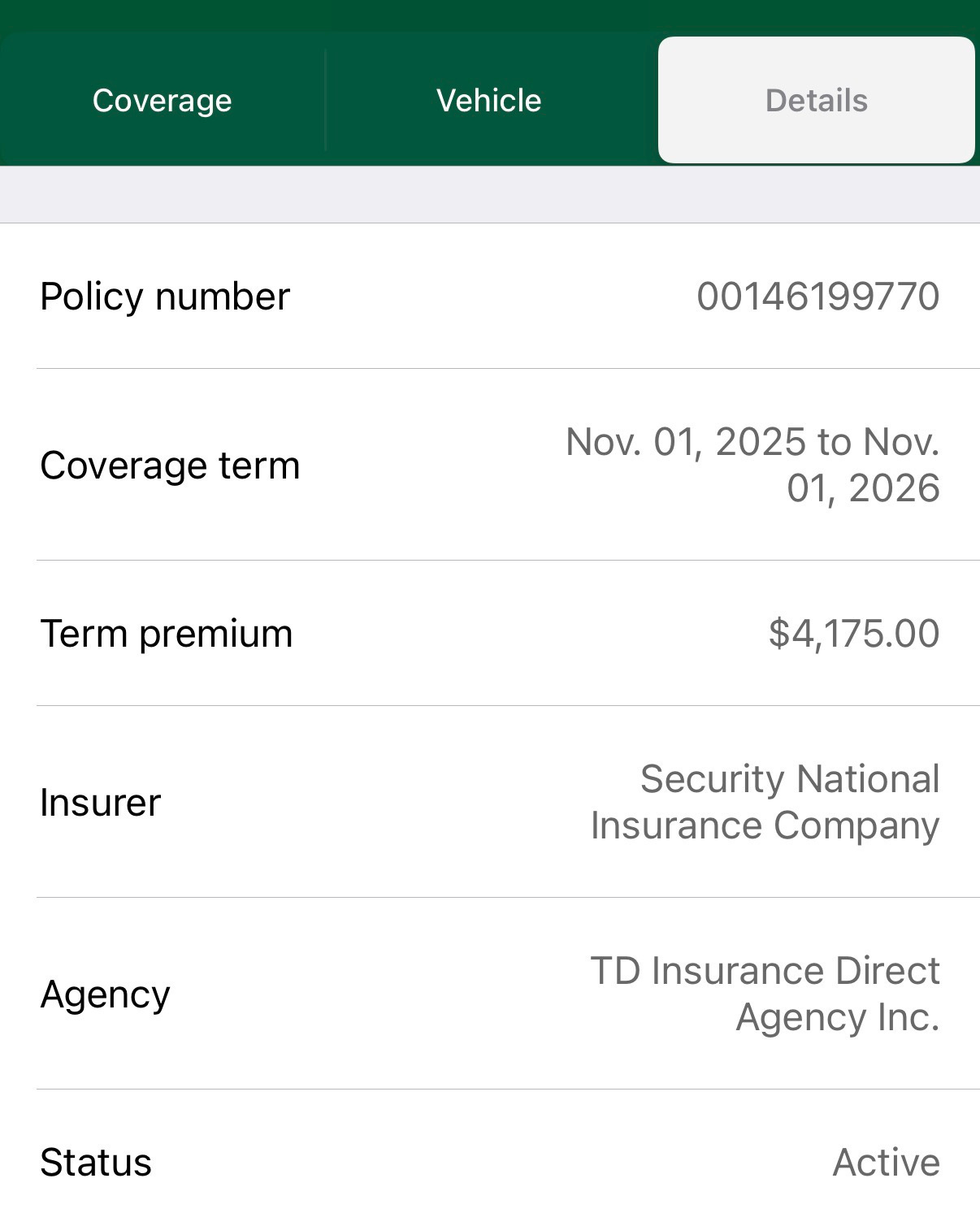
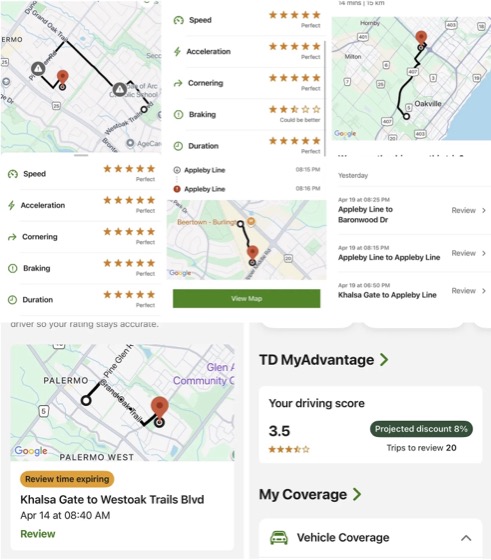
I started with TD Insurance — a common choice for new drivers in Ontario. First year on a G2 license with an MTO-approved driving school certificate and enrollment in their driving score program (TD MyAdvantage), I got about 22% discount. Bill: around $400/month.
After upgrading to a full G, adding experience, zero tickets, zero accidents — premium dropped to about $300/month for two drivers.
Everything was fine until TD switched to a new version of their driving app. That's where this gets interesting from a product and system design perspective.
The score dropped. The discount disappeared.
After the app update, my driving score fell from roughly 4.5 to 3.5. The discount went from 22% down to 8%, then 6%. Premium climbed back toward $400/month.
Quick math on the discount loss alone:
At $300/month with 22% discount, the base premium was approximately:
300 / (1 - 0.22) ≈ $385/month
At 6% discount:
385 × (1 - 0.06) ≈ $362/month
The discount erosion cost roughly $62/month — about $744/year.
The driving score wasn't the only factor. Base premiums shift, pricing models change, risk profiles get re-evaluated. But the score drop was the trigger, and the financial impact was real enough to make me start shopping.
What the app actually measures
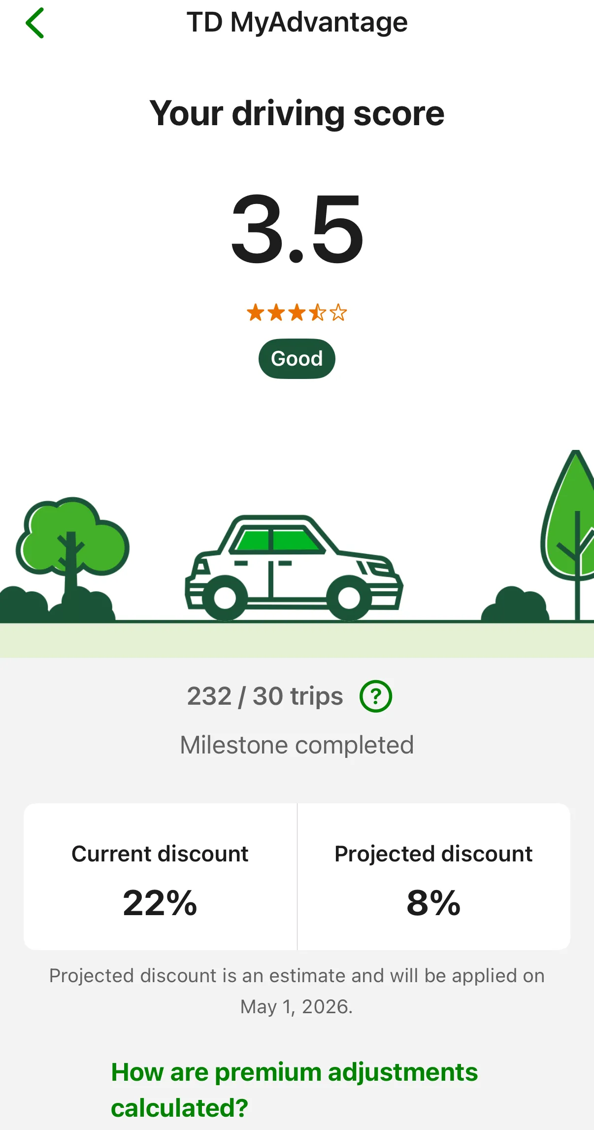
After the app update, the score dropped from 4.5 to 3.5. The projected discount fell from 22% to 8%, erasing most of the financial benefit.
TD MyAdvantage tracks five categories:
- Speed — Are you exceeding the limit?
- Acceleration — Are you accelerating too aggressively?
- Cornering — Are you turning too fast or too sharply?
- Braking — Are you braking too hard?
- Duration — Trip length, time of day, possibly other factors.
This is standard telematics insurance (also called usage-based insurance). The premise is straightforward: drive safely, pay less.
The problem isn't the premise. It's the implementation.
Where the measurement breaks down
Speed
The logic is elementary:
actual_speed - speed_limit = margin
If v_actual > v_limit + margin for long enough, you get flagged. Straightforward.
But the system needs accurate speed limit data, GPS position, and map data. If any of those are wrong — outdated map, GPS drift, incorrect speed limit in the database — the app scores you incorrectly. In school zones with time-based speed limits (common in Ontario, where yellow lights flash during arrival/dismissal hours), the complexity multiplies.
When all conditions align — smooth road, no sudden stops, accurate GPS — the app gives a clean score. But real traffic rarely cooperates.
Acceleration and braking
Technically straightforward:
a = Δv / Δt
Example: slowing from 40 km/h (≈11.1 m/s) to zero in 3 seconds gives roughly −3.7 m/s² — likely flagged as hard braking. The same deceleration over 8 seconds gives −1.4 m/s², which reads as smooth.
The problem: hard braking isn't always unsafe driving.
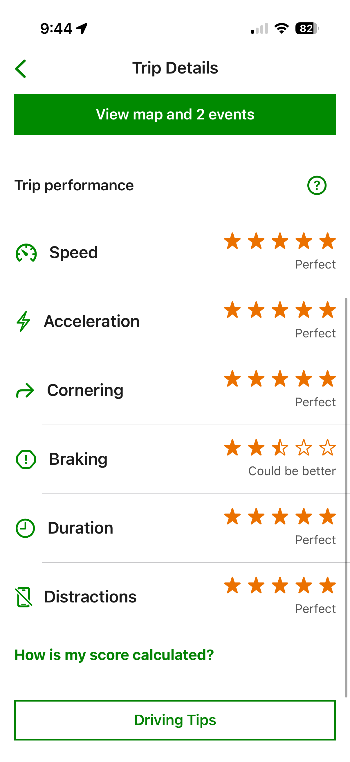
One hard braking event on an otherwise clean trip. The app penalizes the entire trip rather than scoring the event in proportion to the distance driven.
Real-world situations where hard braking is the correct response:
- A pedestrian steps into the road
- The car ahead brakes suddenly
- A yellow light gives you 2–3 seconds before turning red
- Another driver cuts in front of you
- School zone transitions
In these cases, hard braking is safe driving. But if the app only measures negative acceleration and deducts points, it's measuring smoothness, not safety.
This is where many telematics systems fail: the proxy metric diverges from the real-world outcome it claims to represent.
Cornering
Cornering detection likely uses lateral acceleration:
a = v² / r
Higher speed or tighter radius means greater lateral force. Sounds reasonable, but several things cause false readings:
- Phone sitting in a cup holder (sensor angle)
- Sensor calibration drift
- Rough road surface
- GPS jitter
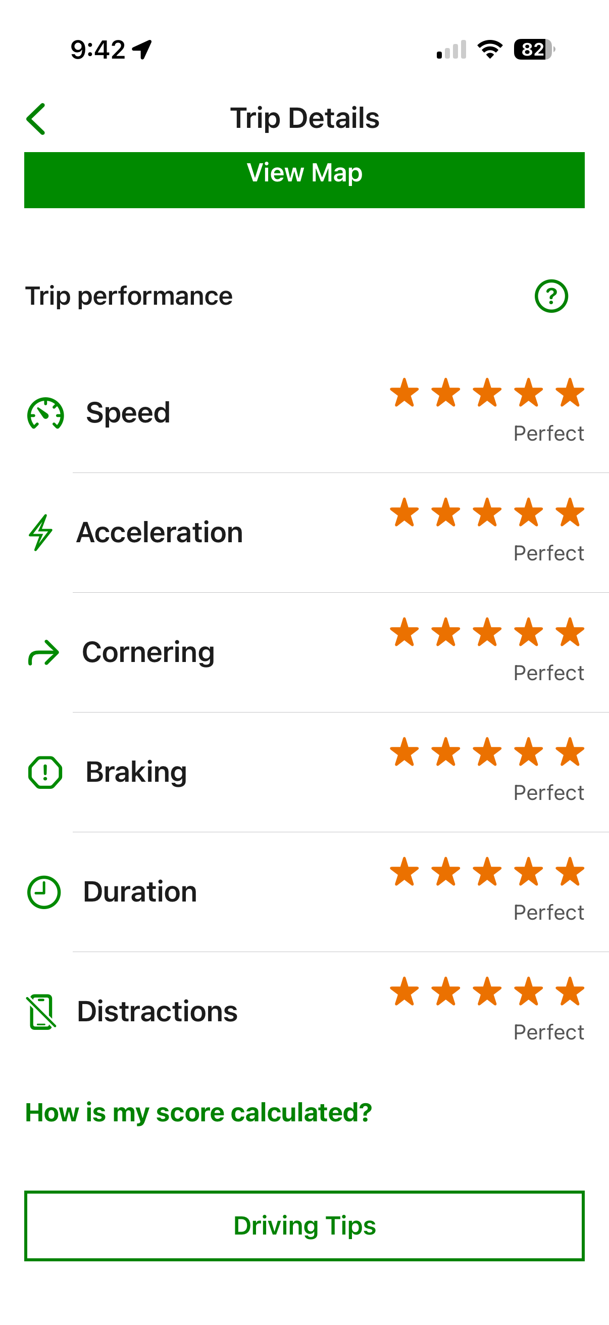
The trip view shows speed, acceleration, braking, and cornering scores per trip. Individual events are visible but the aggregation logic remains opaque.
The real issue: incentive misalignment
I don't think the engineers wrote bad formulas. The math is trivial. What I suspect happened:
- The model is technically correct
- But the thresholds are tuned too aggressively
And this is where the business model creates a conflict.
The app is marketed as a safe driving reward tool. But it also functions as a pricing mechanism, a retention mechanism, and a behavioral control system.
When your discount drops, the company doesn't need to say “your premium increased.” They say “your driving score decreased.” The framing shifts responsibility to you, even when the measurement system is the problem.
This is a textbook case of misaligned incentives. The system begins optimizing for actuarial risk reduction and pricing protection rather than user experience and realistic driving behavior.
The result: users change their behavior not to drive more safely in real traffic, but to drive in ways that produce better sensor readings. They optimize for the app, not for the road.
How I gamed the system (and why that's the point)
With the old version of the app, I discovered that trips longer than about 2 km were scored more harshly. So I developed a habit: every 2 km, I would end the trip in the app and start a new one.
This got my discount back up to 22%.
But this behavior was objectively less safe. I was managing the app while driving — checking distance, timing the restart, tapping the screen — instead of focusing on the road. The scoring system had created a perverse incentive where gaming the app was rewarded more than actually driving safely.
Ontario's road design made this easy to exploit. In suburban areas, highway on/off ramps are spaced roughly every 2 km. In urban areas, traffic lights are about 2 km apart or denser. Every red light became a trip reset point.
Aggregation logic makes it worse
The app appears to weight negative events disproportionately.
Example: a 20 km trip goes perfectly except for one hard braking event. Instead of scoring the event as 1 incident across 20 km, the app seems to treat it as if the entire trip was characterized by hard braking. The score for that trip drops significantly.
On highways, this compounds. Nobody holds exactly 100 km/h — speeds naturally fluctuate between 80 and 130 km/h depending on traffic. The variance alone generates scoring events.
This creates what I'd call a punitive feedback loop:
- The score doesn't recover easily
- The system feels unfair
- The feedback is disproportionate to the behavior
This is a dangerous UX pattern. When users stop believing the score reflects reality, three things happen: they disengage from the program, they change behavior to game the system instead of drive safely, or they churn.
I did all three.
The exit
After several days of frustration, I called TD to ask about cancellation costs. When the customer service rep offered to re-enroll me in the driving program with an estimated 10% discount, I declined immediately.
The mental overhead — opening the app, watching the score, worrying about deductions — wasn't worth even 20% off. I'd only re-engage if the discount was guaranteed at 20% or higher, with a transparent scoring system I could actually trust.
I went shopping.
Before
TD Insurance
- Monthly premium
- ~$400/mo
- Driving discount
- 6%
- Driving score
- 3.5 / 5
- Includes home insurance
- No
After
New Insurer
- Monthly premium
- ~$260/mo
- Driving discount
- 10% upfront
- Driving score
- N/A (upfront)
- Includes home insurance
- Yes
I switched.
What product teams should learn from this
Many digital product teams assume that more telemetry, more metrics, and more “AI-driven” scoring produces better outcomes. But the bottleneck is usually the measurement system itself.
When the measurement doesn't reflect reality, users feel punished rather than supported. TD MyAdvantage used to exist as a standalone app on the App Store, where it never exceeded a 3-star rating. After TD integrated it into their main insurance app, users lost the ability to give direct feedback through the App Store rating system — someone decided to bury the signal by removing the feedback channel entirely.
The core failure pattern:
- Proxy metric ≠ real-world outcome. Hard braking is used as a proxy for unsafe driving. But hard braking is often the safest possible response.
- Threshold sensitivity tuned for the business, not the user. Aggressive thresholds reduce payouts. They also reduce trust.
- Aggregation logic punishes disproportionately. One event shouldn't define a 20 km trip.
- Gaming becomes rational. When the system rewards sensor-friendly behavior over actually safe behavior, users will optimize for the sensor.
- Removing feedback channels doesn't fix the product. It just hides the evidence.
The lesson: if your scoring system makes users change their behavior in ways that are worse for them, your incentives are misaligned — no matter how technically correct the underlying model is.